❌ Current Problems
Menu locked behind commitment
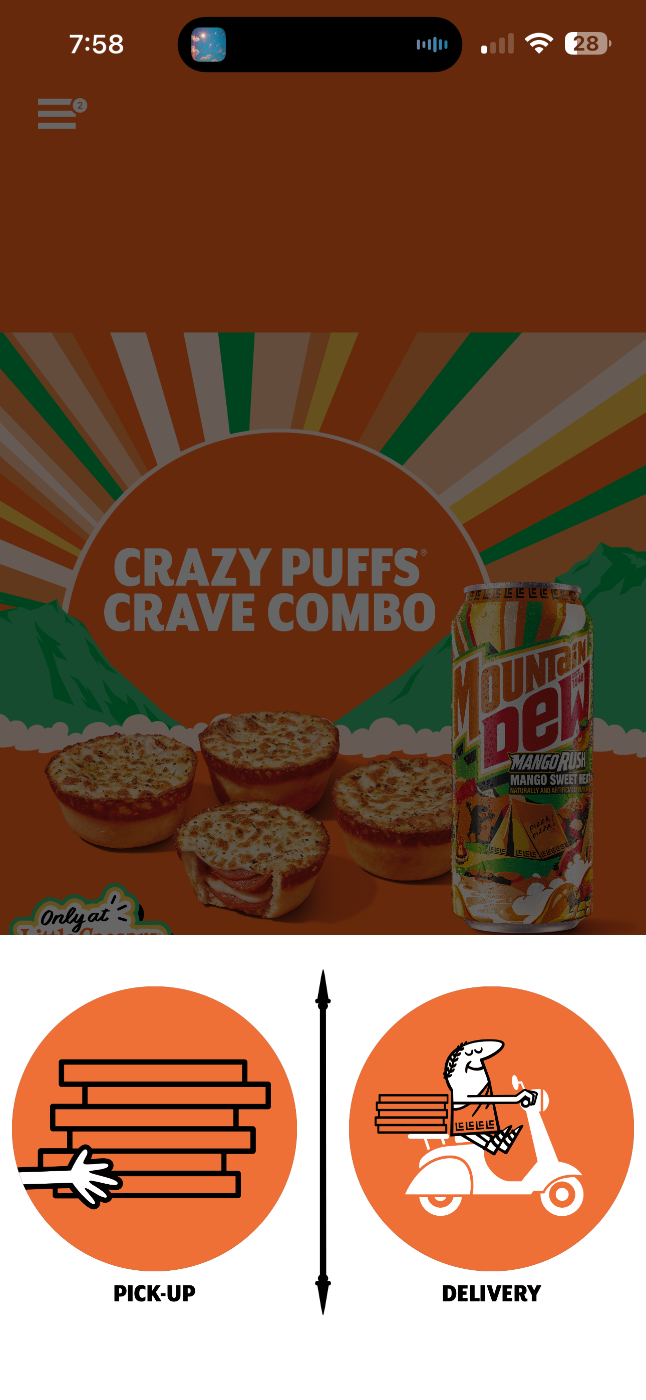
Must choose Pick-Up or Delivery before seeing any food. Browsing requires commitment.
4-screen gate total
Home → Pick-Up/Delivery → Location+Time → Start Pickup → THEN the menu. Users abandon before seeing anything.
Ad persists through the gate
Even on this screen, the full-screen Crazy Puffs promo runs above the Pick-Up/Delivery choice. No escape from the ad.
No browse mode exists
Zero path to see the menu, check prices, or explore without completing the full order setup.
Drop-off cliff
"Just checking prices" users have nowhere to go. Impulse decisions die in commitment flows.
Before — Actual App
After — Redesigned
9:41
●●● WiFi 🔋
LC
Pickup from
Fallbrook, Canoga Park
Home
Menu
Order
Deals
Account
✅ Redesign Fixes
One tap, immediate access
Menu tab in the bottom nav goes straight to the full menu. No commitment, no gate, no signup wall.
Search-first design
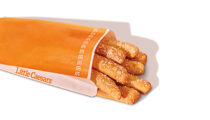
Large search bar at the top for direct item lookup. Find Crazy Bread in one tap instead of scrolling.
Category filter chips
Swipeable chips — All, Pizza, Sides, Wings, Drinks, Combos. Instant filtering, no page navigation.
Hot-N-Ready at the top
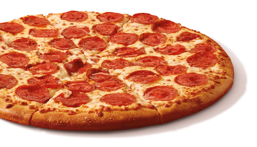
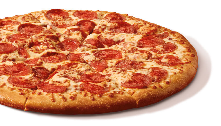
The green HNR card pins the ready-now item above everything. Users see it before scrolling a single pixel.
Browse, then decide
Add to cart directly from the menu. Pickup/delivery method is chosen at checkout — not as the price of entry to browse.