UX/UI Case Study ยท 2026
A ground-up rethink of the Little Caesars mobile ordering experience โ replacing promotional dead ends with real utility, surfacing Hot-N-Ready status, and collapsing a 4-screen order gate into a single tap.
Before touching a single screen, I reviewed recent App Store ratings and 1–3 star reviews. Three friction patterns showed up again and again — and every design decision in this redesign maps directly back to them.
Users couldn’t see a single menu item without committing to a location, order type, and pickup time first. The ordering flow was built for the restaurant — not the customer.
“This app makes ordering harder than necessary. The menu is an insanely long scroll list and the categories are basically hidden since you can’t jump to them.”
★★☆☆☆ — Matango88, Jan 2026“Prices and deals are only available when ordered through the app, but it’s very hard to see where they are.”
★☆☆☆☆ — Kathy tbh, May 2026Users wanting basic modifications — no salt, party cut, light sauce — had no path forward except upgrading to a pricier “Create Your Own” option. The app was training customers to call in instead of ordering digitally.
“How do you have a pizza app that doesn’t allow you to customize your toppings? If you want no onions or light sauce, you can’t do it.”
★☆☆☆☆ — LJD062, May 2026“I love the pretzel crust but can’t handle all the salt. My only options are to order in person or call in — both slow down the staff.”
★★★★☆ — billconiglio, Mar 2026The app presents a tip prompt at checkout — before the user has received their food, interacted with a single employee, or confirmed their order is correct. For a Pizza Portal pickup with zero human contact, users had no idea who they were tipping or why. Reddit threads called it out repeatedly.
“At the point where it asked me to give a tip, I had no knowledge of what service I was about to receive, the quality of the food, or if I was even handed the correct order. From order to consumption I had 0 human contact whatsoever.”
r/EndTipping — 100 upvotes, 50 comments“I used to praise that they were one of the last food businesses without bs tipping… Lost customers because they can’t pay staff.”
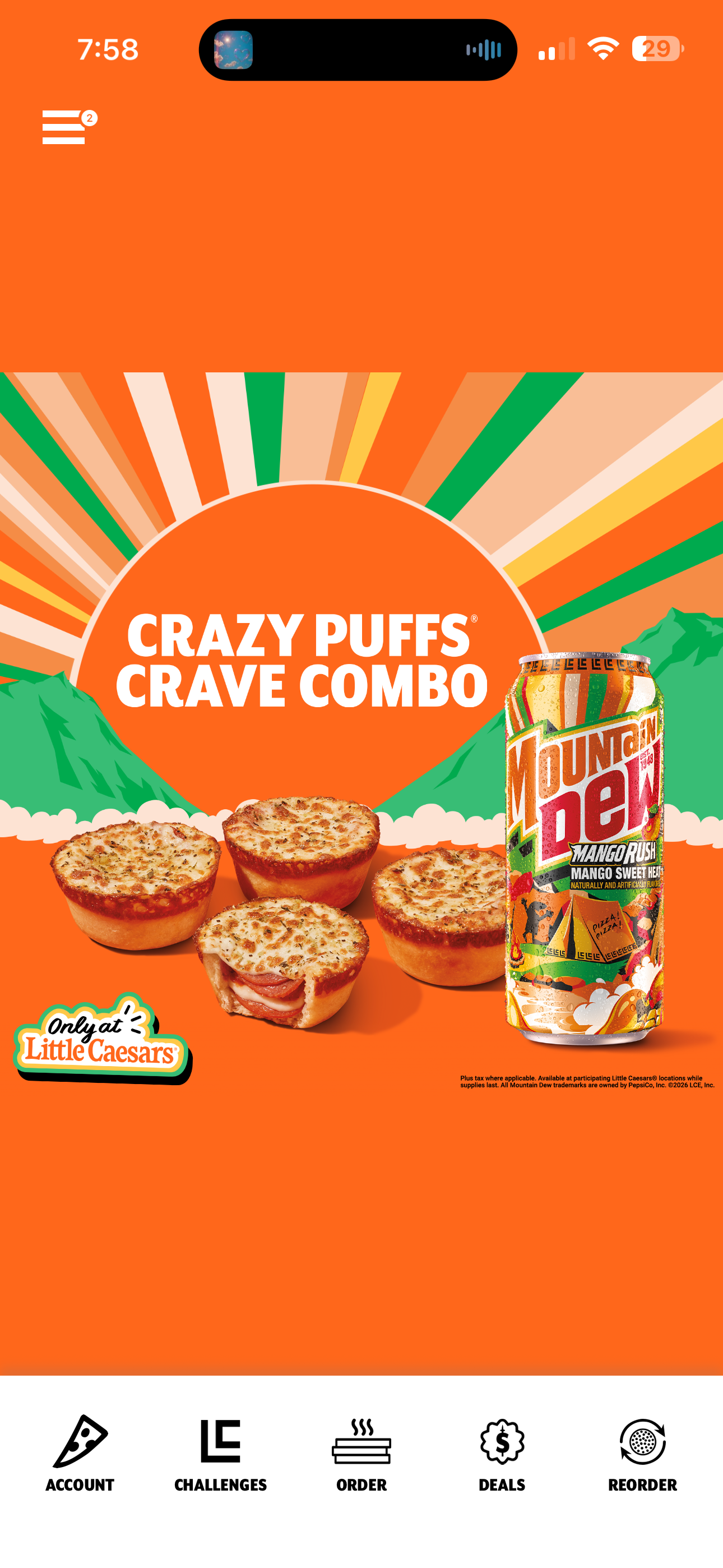
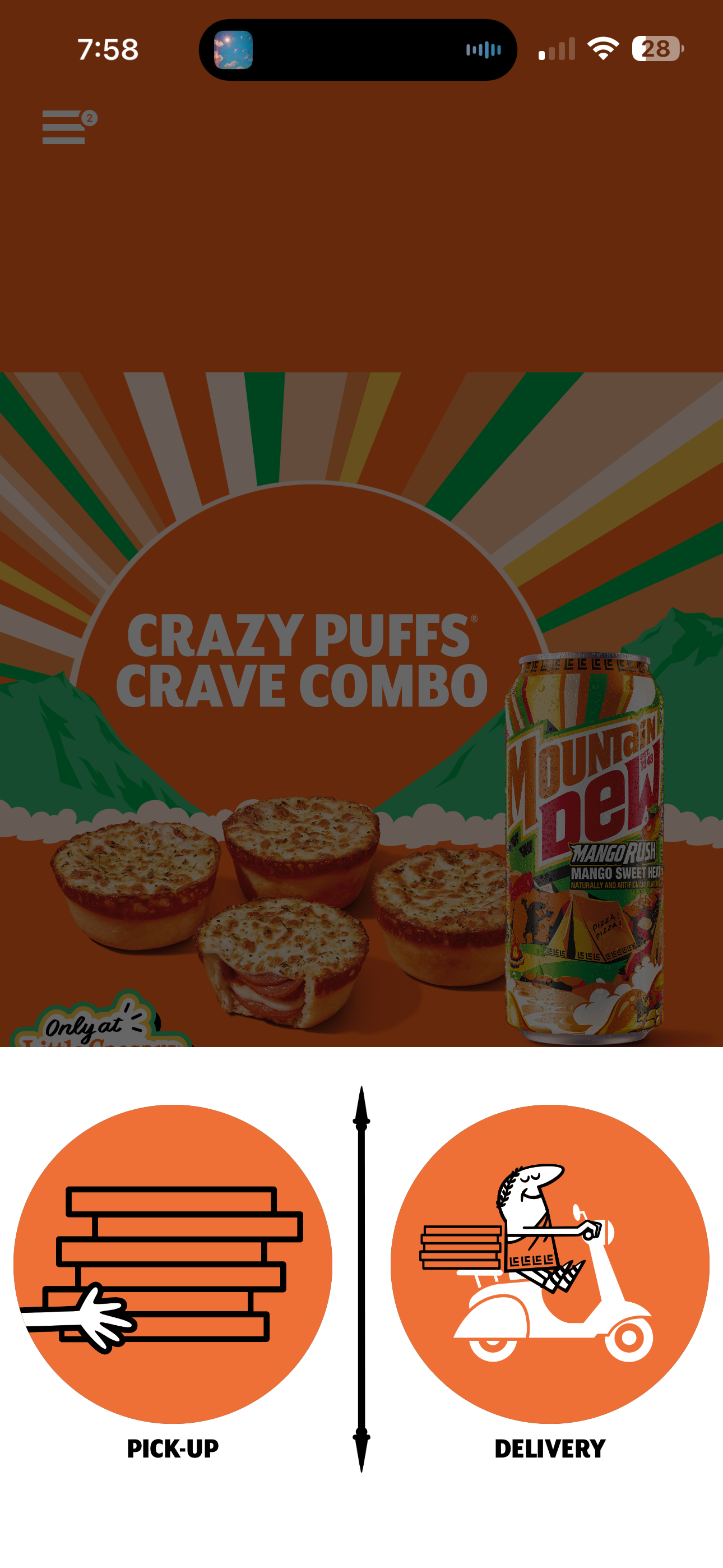
r/EndTipping — CarmelloYelloThe current app opens to a full-screen promotional banner โ zero utility, zero menu, zero context. The redesign surfaces Hot-N-Ready status, store location, and the full menu before the user taps once.
Real iOS screenshot

Utility first, brand intact


Dark header, refined typography


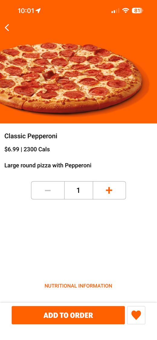
The current app has no item detail screen. Customization doesn't exist โ you get what's on the menu. We designed a bottom sheet that slides up from any menu item, letting users configure crust, flavor, and quantity before adding to cart.
Real iOS screenshot

Bottom sheet customizer

Dark bottom sheet, editorial feel

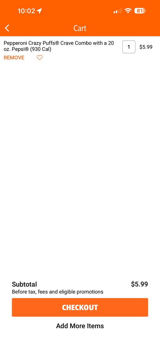
The original app's checkout is a gauntlet โ store context disappears, totals are buried, and the path to payment requires multiple taps. We rebuilt it as a single screen with store context always visible, live order totals, and one-tap checkout.
Real iOS screenshot

Store context + single-tap checkout


Dark checkout, editorial feel


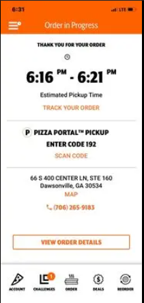
The original app has no order tracking. After you place an order, you get a confirmation number and nothing else. We designed a live status stepper with three states โ Order Received, Preparing, Ready for Pickup โ plus store info and quick actions.
Real iOS screenshot
Live status stepper
Dark tracking, animated stepper
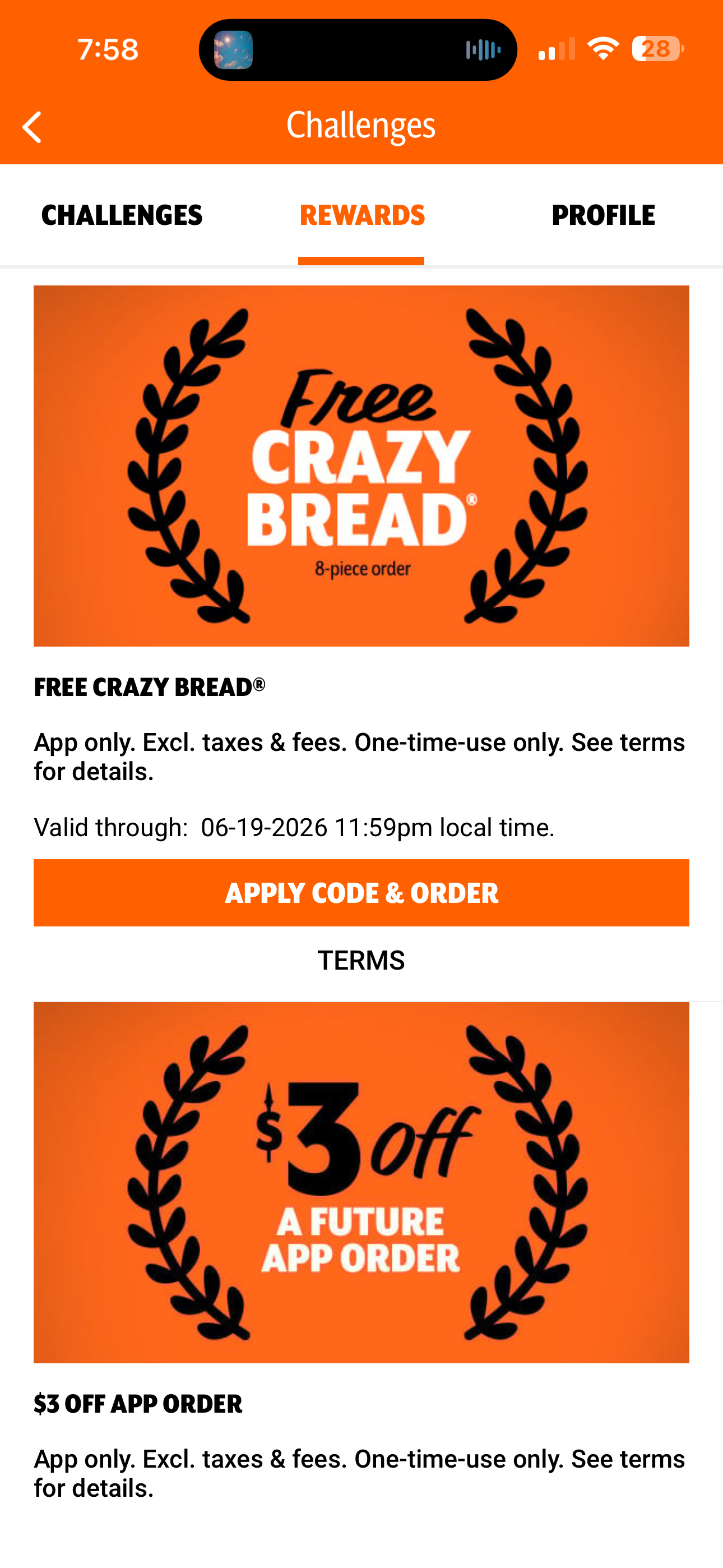
Deals were buried two taps deep under Challenges โ Rewards with no main nav entry. Caesar Crown points were invisible. We surfaced everything into a dedicated Deals tab with loyalty front and center.
Real iOS screenshot

Deals tab + loyalty visible
Dark cards, loyalty prominent
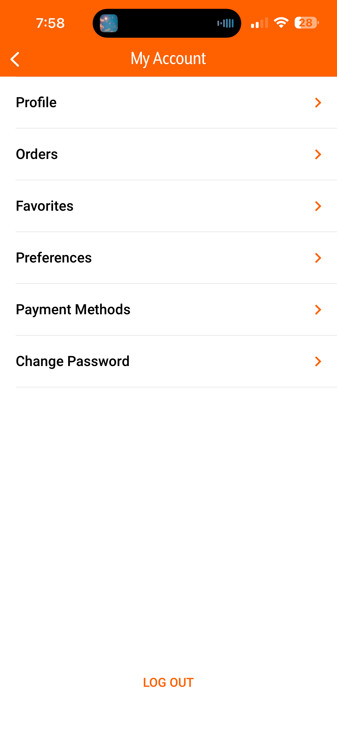
The original account screen is a plain list with no user identity, no loyalty context, and a lonely Log Out at the bottom. We surfaced the user's profile, Caesar Crown points, and reorganized actions by frequency of use.
Real iOS screenshot

Profile card + reorganized list
Dark profile, refined list